


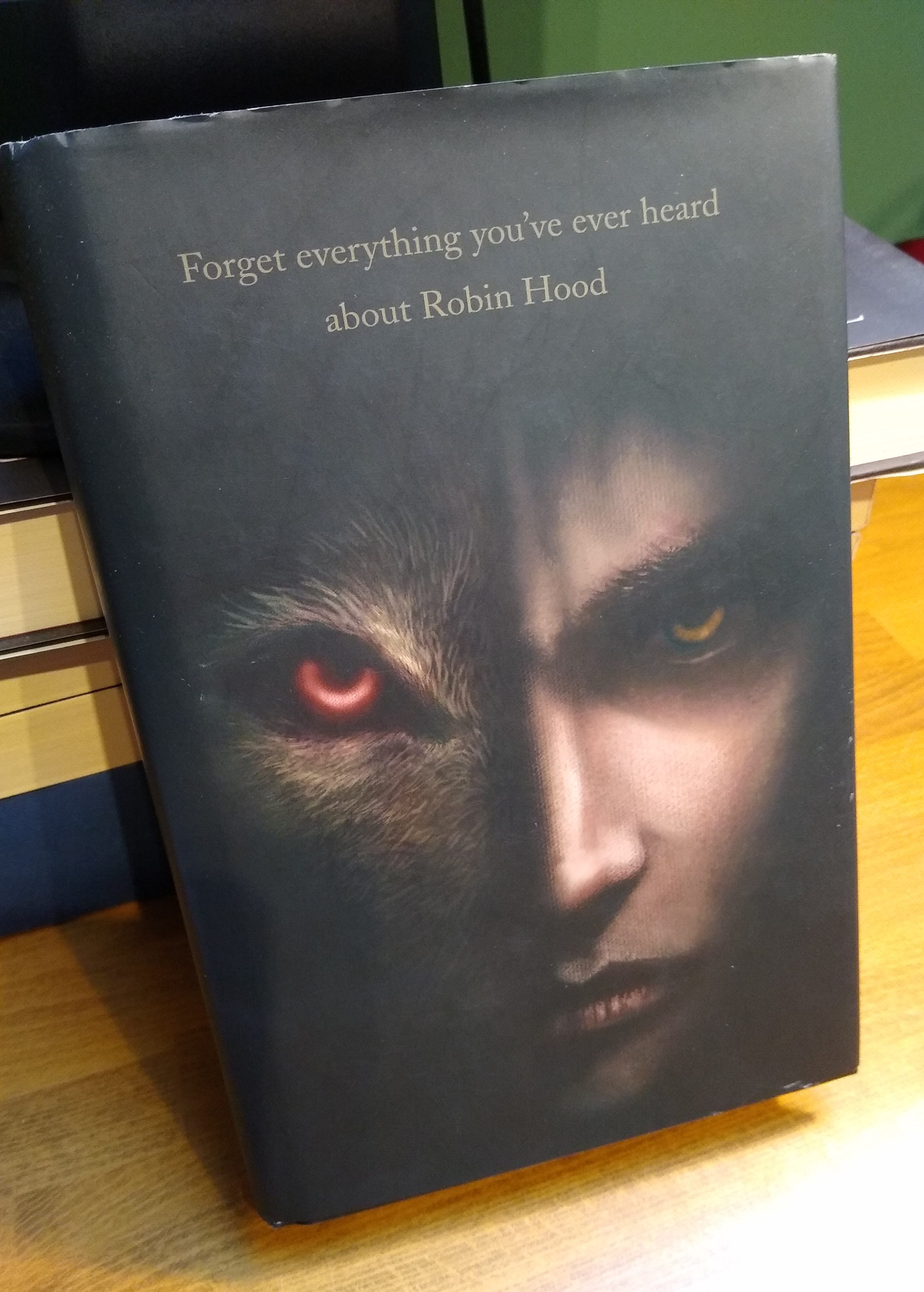
When my debut novel, Shadow of the Wolf, was first released, my publisher did something almost unprecedented. They left the novel’s title and the author byline off the cover. The book went out into the world bearing only an image and a strapline: ‘Forget Everything You’ve Ever Heard About Robin Hood.’
This might sound like commercial suicide. In a saturated market, a new book has to work hard to be noticed. A novel without even the title on the cover will take time to investigate – time in which a flashier, louder book may grab the customer’s attention.
Of course, my publisher, David Fickling, was aware of all that. He wasn’t trying to hide my novel, but rather get it noticed by different means. He wanted Shadow of the Wolf to stand out from the crowd not by shouting more loudly, but by being unique.
Whether this worked or not is difficult to tell. Shadow of the Wolf didn’t fly off the shelves. But would it have sold any better had it sported a more traditional cover?
Either way, I don’t regret my publisher’s decision. For one thing, I take it as a huge compliment. In decades of publishing, David Fickling has presented a book in this way just once before. When he first published Philip Pullman’s Northern Lights, one of the greatest children’s stories of all time, he released a hardback with only an image on the cover. For my book to follow in the footsteps of Philip Pullman was a special honour!
But the main reason I’m glad about the decision is because it resulted in a thing of beauty. The original cover’s artwork, with its face of two halves, one fully human, and one more bestial, was drawn by the brilliant illustrator Richard Collingridge. His cover is magnificent. I keep a copy of the hardback near my writing desk and it’s a wonderful object to own. I’ll only ever have one debut novel, and I’m glad it’s this rare treasure.
So far, so romantic. But times have changed. The scrabble for sales is fiercer than ever. My publisher, David Fickling Books, has perhaps become a little more hardnosed.
So last year, when Shadow of the Wolf was republished, it appeared wearing a very different skin. This time, my publishers chose to move away from dark and enigmatic, and went instead for bold and dramatic. The new edition features a title you can’t miss, and colours that explode off the cover
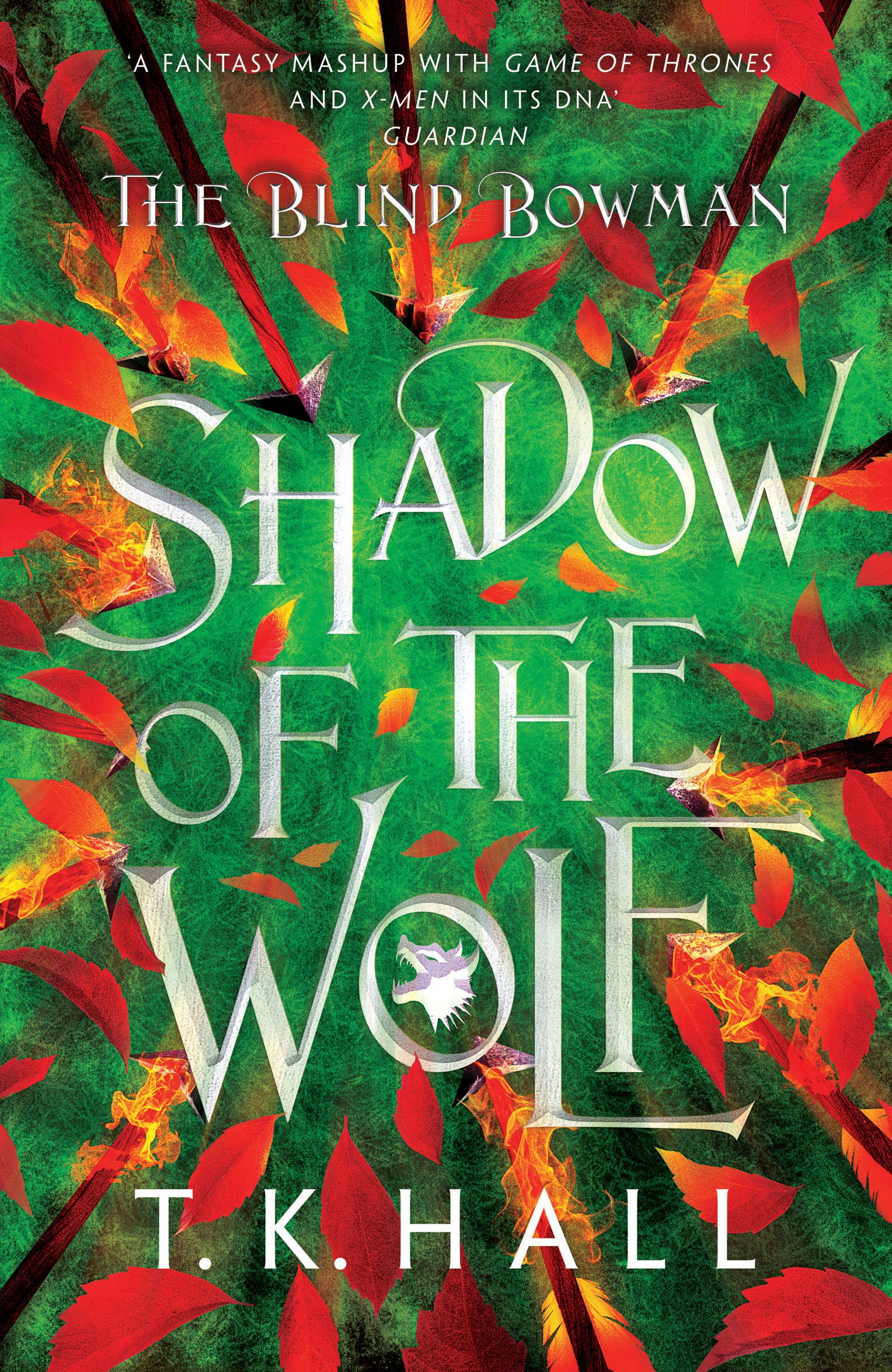
This was partly driven by marketing trends. Fantasy novels, particularly in the Young Adult category, now tend to feature stylised designs with prominent fonts. My publisher wanted to persuade booksellers and sales reps that this book should be placed alongside Sarah J Mass and Leigh Bardugo and the rest.
The new approach was also designed with the book’s sequels in mind. The Blind Bowman trilogy is now finished, which meant all three covers could be drawn simultaneously. By foregrounding the font, and repeating certain colours and graphical cues, they achieve a visual unity across the series.
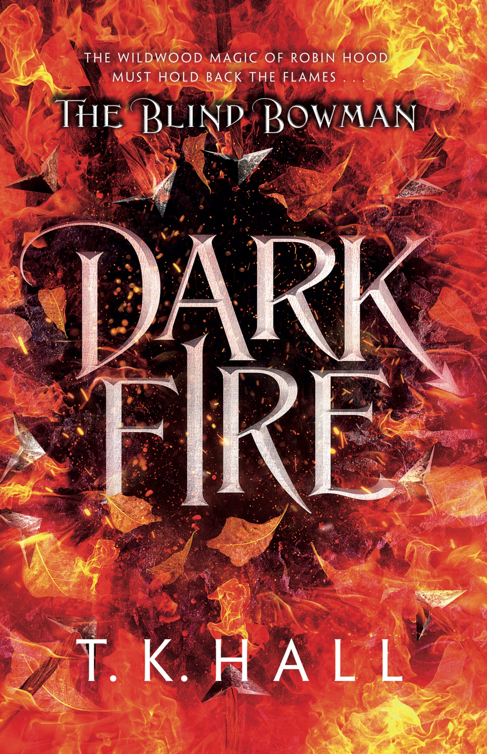
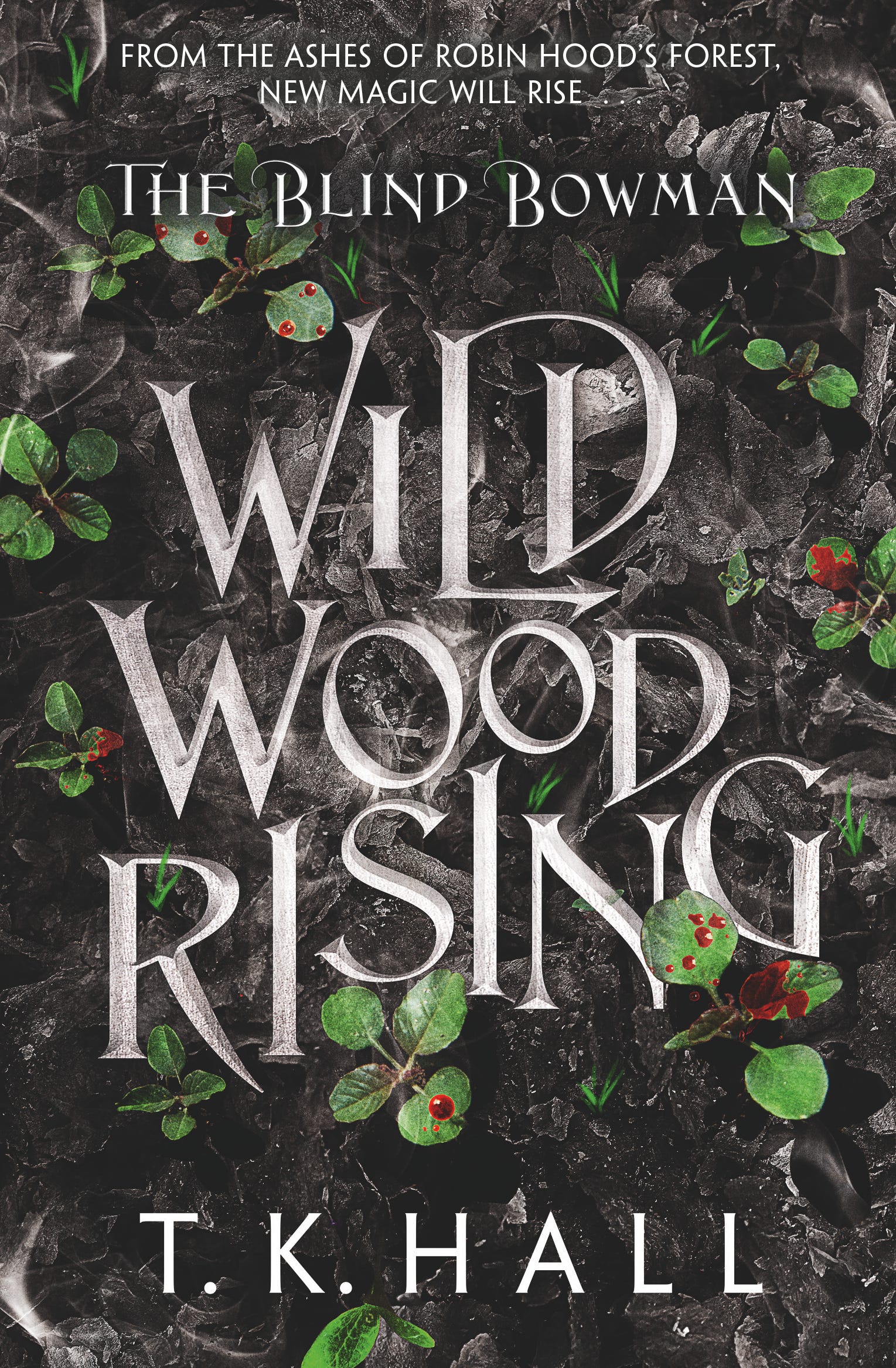
They also follow a narrative sequence: on the first cover, flaming arrows are arcing into the wildwood; on the second, the trees are engulfed in fire; in the third there is a burned wasteland where the forest once stood.
In their own way, these covers are great. They certainly draw attention to themselves. But that shadowy first edition will always have pride of place on my bookshelf.
Which do you prefer?
Thanks for being here - and happy reading!
Tim
As much as I love the new covers nothing beats the original! I remember finding it on a shelf instantly being drawn to it, already thinking I’m gonna like this, then seeing it’s about Robin Hood and knowing right then and there I’m going to love this book!